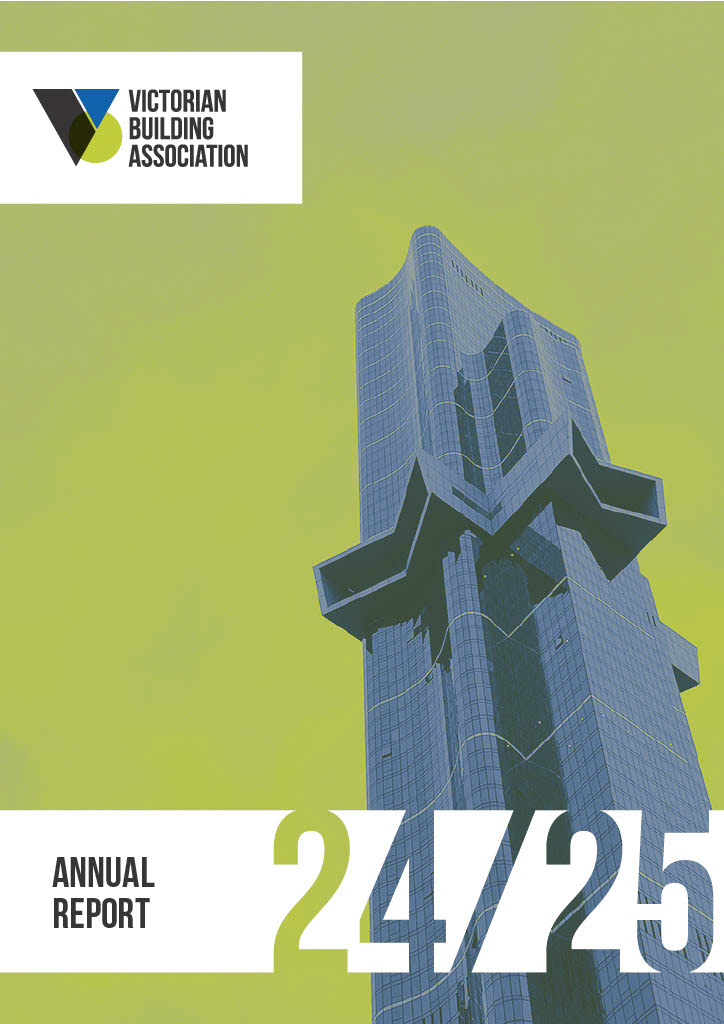
Front Cover
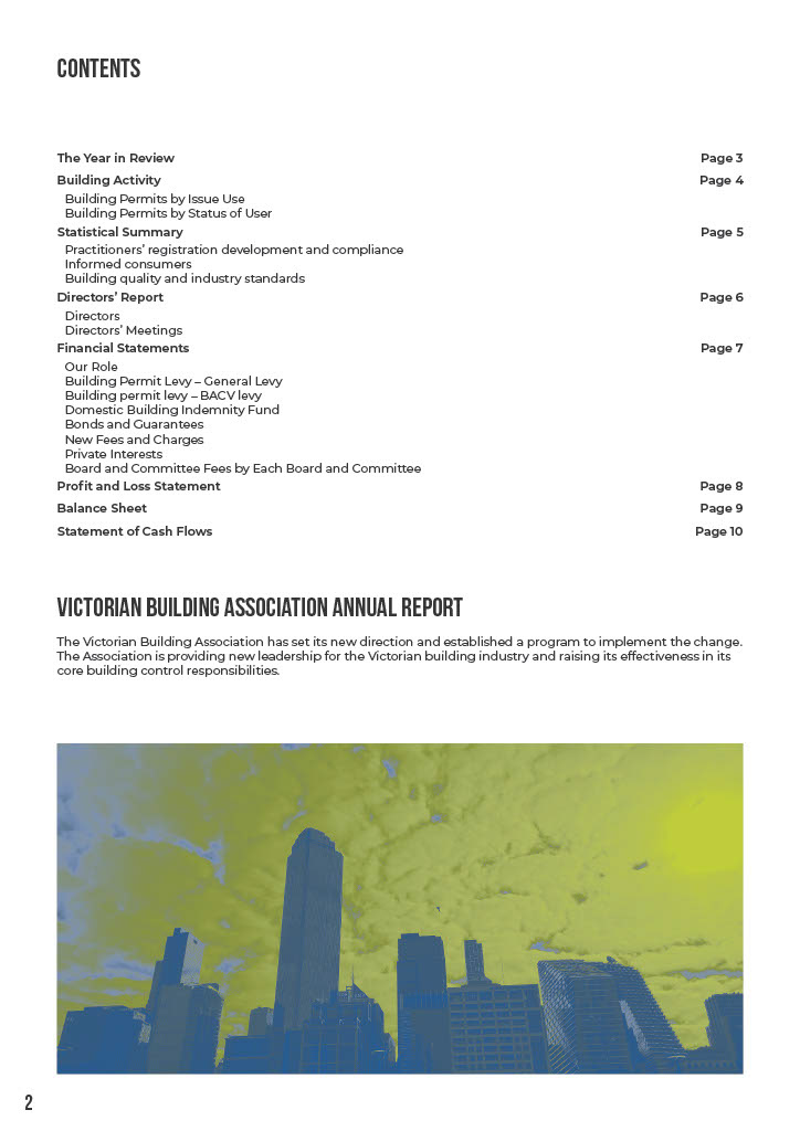
Contents
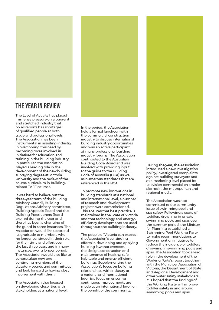
Year in Review
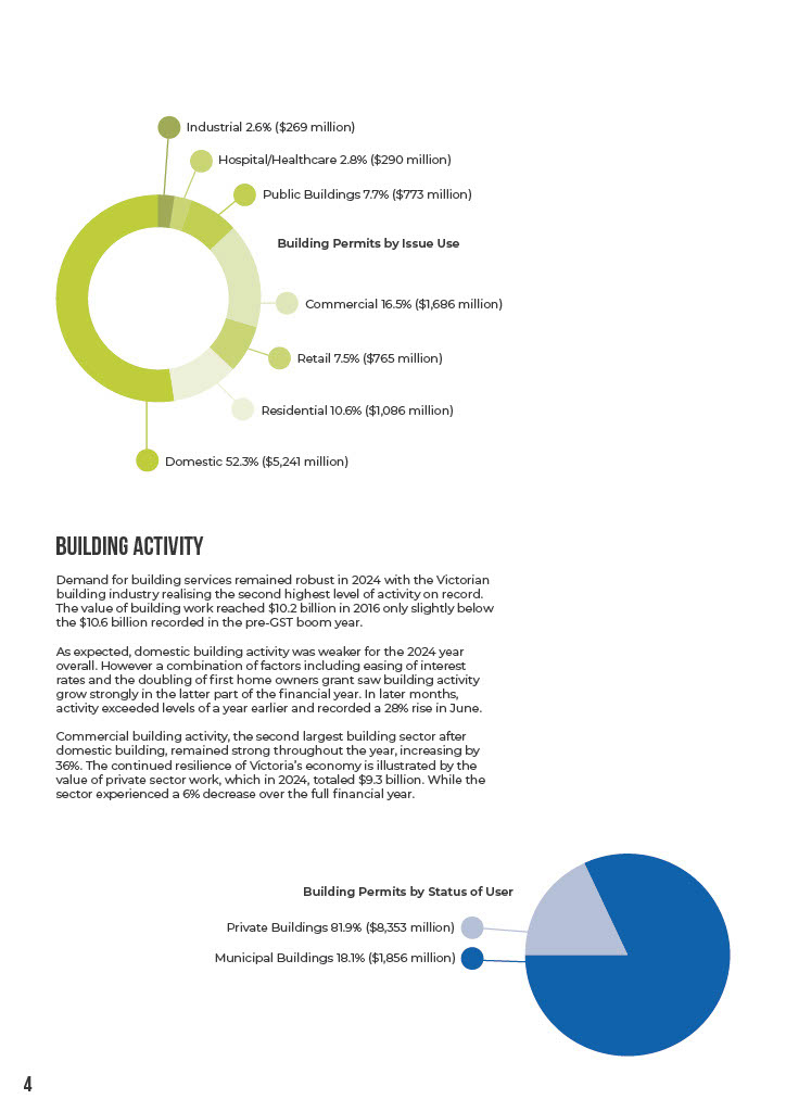
Graphs
Financials
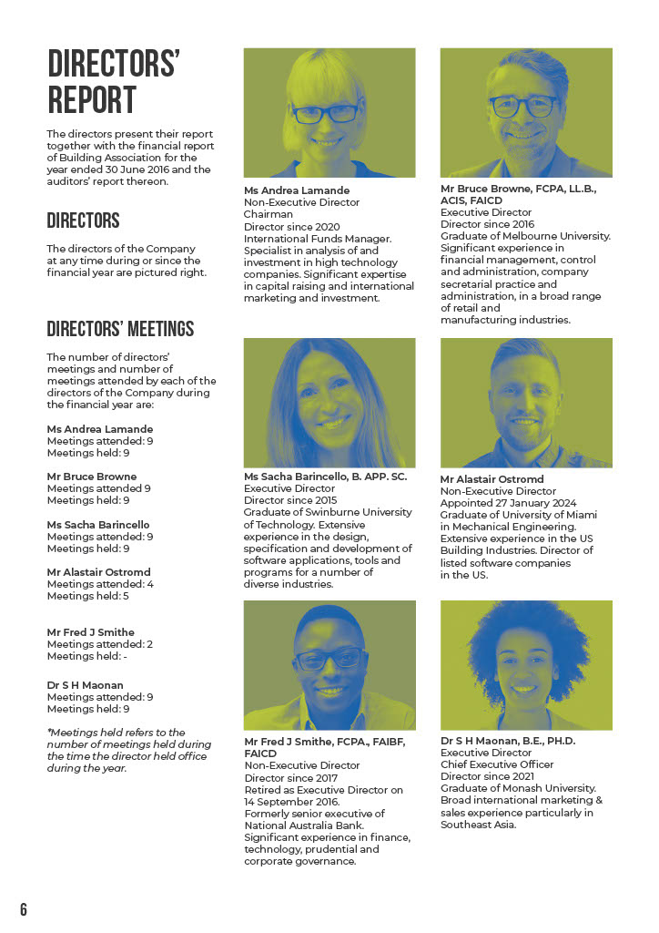
Directors' Report
Financial Statements
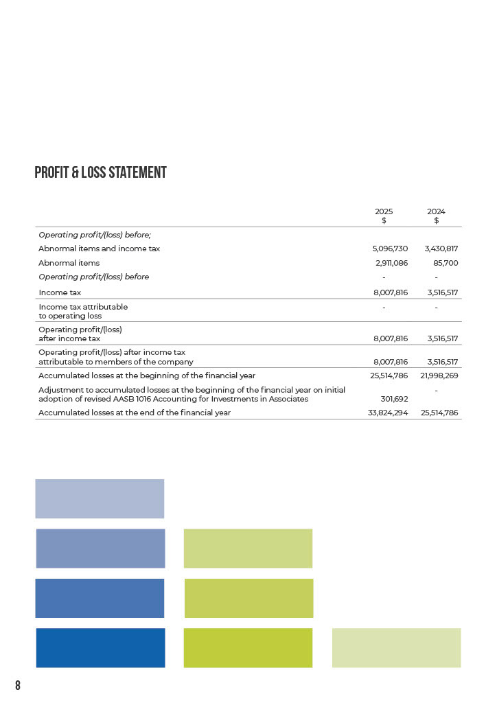
Profit/Loss
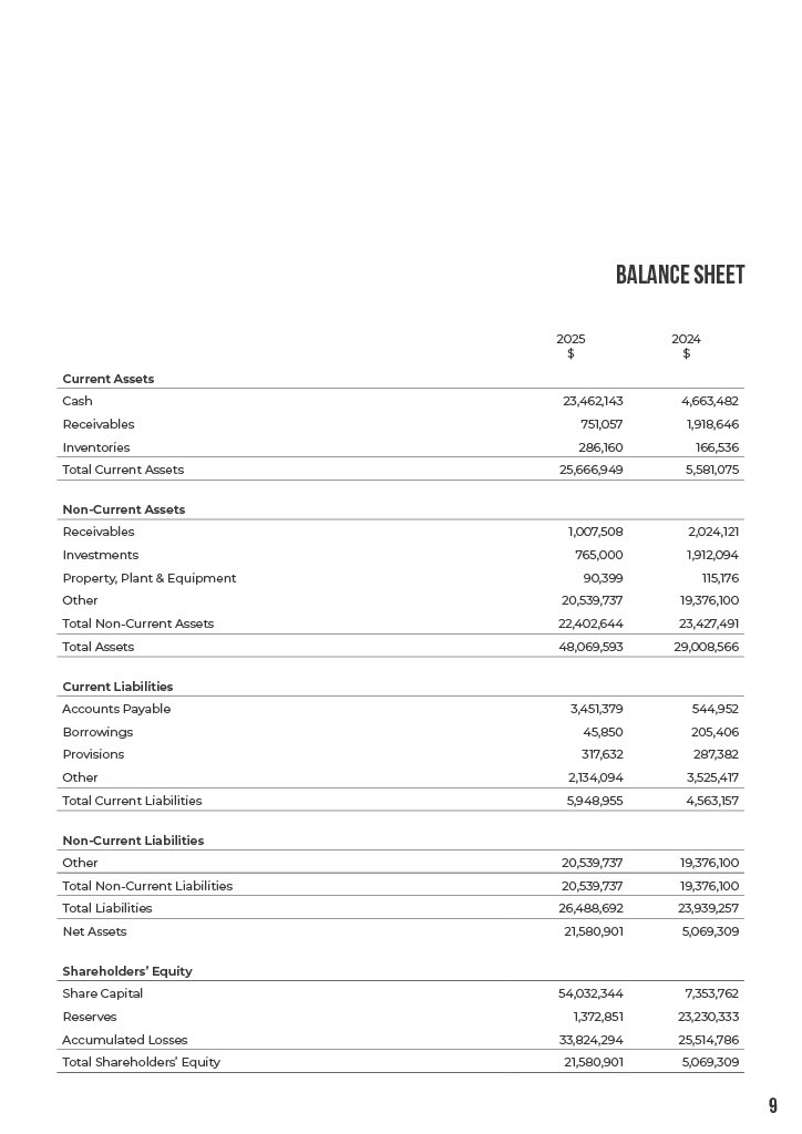
Balance Sheet

Cash Flow
Back Cover
Project Overview
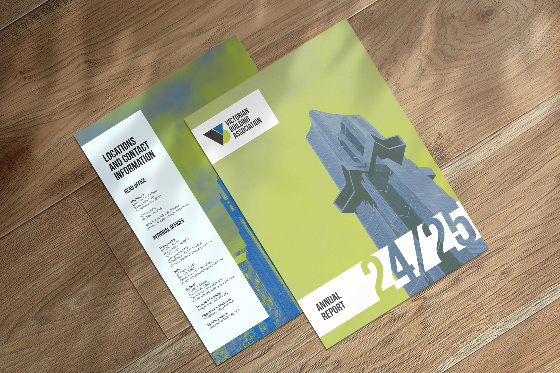
This project involved the creation of a 12-page Annual Report and a redesigned logo for the Victorian Building Association. The aim was to deliver a professional, print-ready publication showcasing skills in layout design, typography, and the integration of text, graphics, and photography. The design featured a consistent three-color palette, custom duotone effects, and original architectural imagery of Melbourne’s CBD, aligning with the association’s brand and mission.
The Challenge
1. Limited Colour Palette: Design within a strict three-colour framework (Pantone 293 C, Pantone 390 C, and Pantone Pro Black) while maintaining visual interest and harmony.
2. High-Quality Imagery: Capture original architectural photographs to reflect the association’s focus on Melbourne’s iconic skyline and its building standards.
3. Print Readiness: Ensure all files were correctly prepared for printing, including accurate colour separations, bleed settings, and adherence to industry standards.
The Process
Phase 1: Concept and Colour Design
• Established a cohesive colour palette of blue, green, and black to reflect the association’s professionalism and alignment with the built environment.
• Applied tints, shades, and duotone effects to maintain depth and variety while adhering to the limited palette.
• Used separation preview tools to ensure precise colour applications for printing.
Phase 2: Photography
• Captured architectural imagery in and around Melbourne’s CBD using an iPhone, showcasing the city’s diverse architectural styles.
• Focused on achieving efficiency and flexibility while maintaining high-quality imagery for integration into the report.
Phase 3: Layout and Design
• Designed a clean and professional layout in Adobe InDesign, featuring a logical flow of information with clear sections for content, financials, and contact details.
• Integrated bold typography and custom graphical elements to add visual interest and highlight key data points.
• Designed a new logo for the association, featuring a modern, geometric style that aligns with the building industry’s precision and forward-thinking approach.
Phase 4: Finalization and Print Preparation
• Conducted preflight checks to ensure all links and fonts were properly embedded.
• Prepared files with bleeds and printer marks, ensuring the design met industry standards for professional print production.
The Solution
1. Three-Color Palette: Successfully utilized a limited palette to create a visually engaging design with depth and consistency, employing duotone techniques for imagery.
2. Original Photography: Showcased Melbourne’s architectural variety through custom-captured images, reinforcing the association’s focus on building excellence.
3. Professional Layout: Delivered a clean, easy-to-navigate report with strong typography and graphical elements that balanced functionality and aesthetics.